Singapore Botanic Gardens
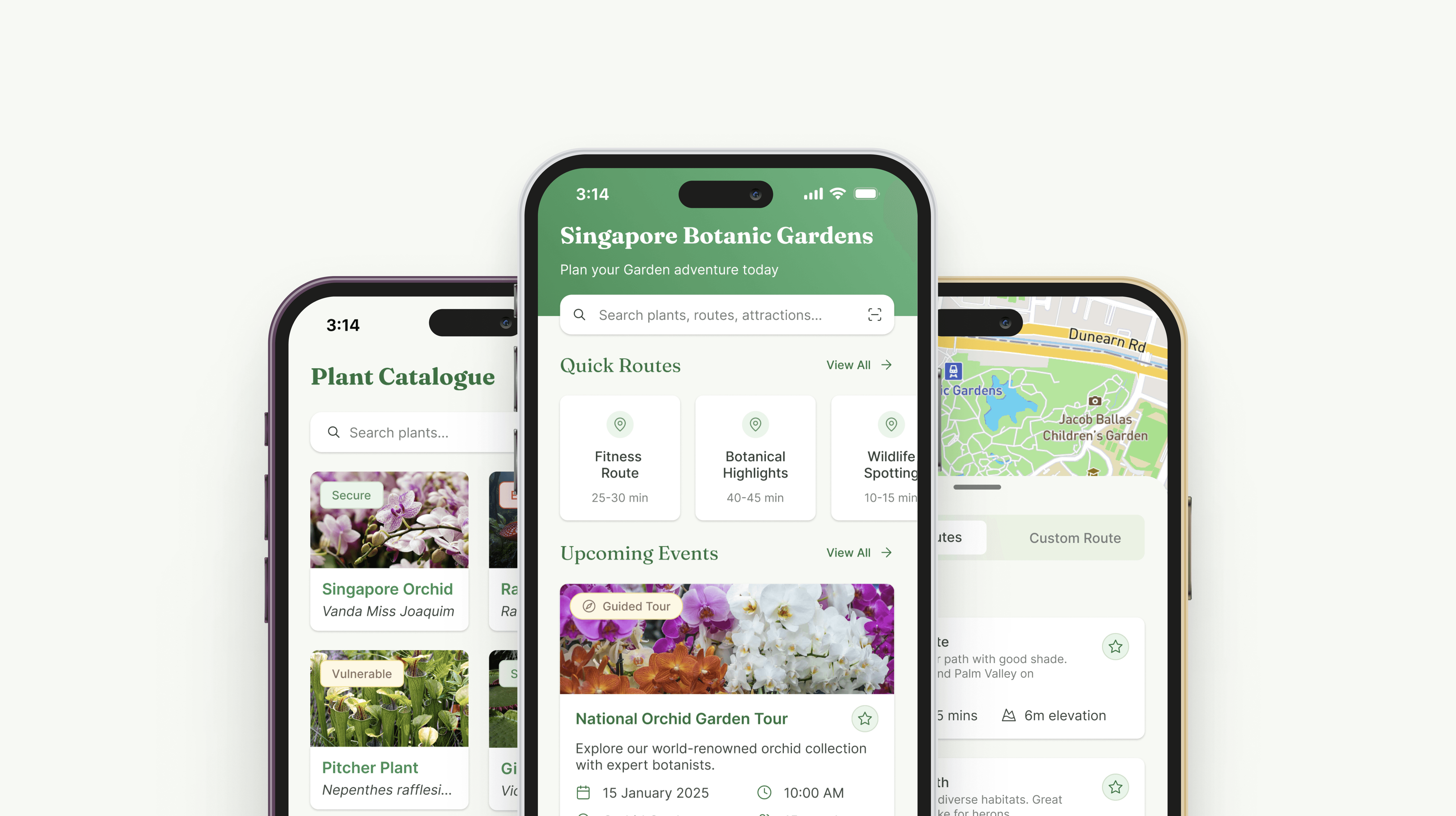
Worked across research, design and testing in a four-person UX team building a Singapore Botanic Gardens app, leading the research and then independently redesigning the entire product. The redesign delivered personalised navigation, plant identification and event discovery that complemented visitors' time in nature, lifting the app's usability score from 54 to 86 (SUS).
Role
UX Research, Design & Testing
Year
2025
Platform
Mobile
Tools
Figma
Overview
The project was a mobile app for the Singapore Botanic Gardens, developed by a UX team at General Assembly, with my contribution spanning research, design and testing. The team treated what began as a bootcamp brief as a real-world challenge, grounding our decisions in discovery research before shaping a first version of the product. When testing exposed the concept's limits, I took the work further on my own, reworking the entire app into a more refined, easier-to-navigate experience centred on the diverse visitor needs we had uncovered.

The Challenge
Visitors to the Singapore Botanic Gardens faced real challenges that diminished their experience: difficulty navigating the sprawling 82-hectare space, trouble finding information about plants, and limited awareness of events and activities. The Gardens were valued as a natural, largely offline place to escape to, so the design challenge was to solve these practical problems while respecting that peaceful atmosphere, surfacing the right information at the right moment so the app supported the visit without intruding on it.
Discovery & Research
During the research phase we conducted 15 interviews with both visitors and staff, complementing these with participant observation (joining tours) and non-participant observation to understand visitor behaviours in context. We identified three visitor groups with distinct needs:
Fitness enthusiasts. Focused on distance tracking and route efficiency.
Nature lovers. Interested in species detail, conservation context and deeper botanical knowledge.
Tourists. Needing efficient route planning and event discovery.

A key insight emerged through observation. While many visitors said they came to the Gardens to "unplug," we noticed they still reached for their phones in brief moments: taking photos (nature enthusiasts, tourists), listening to music (runners), or quickly checking maps (all groups). We also watched visitors photograph event banners to reference later. As one tour guide explained:
"A lot of visitors don't know how much is going on here. They only hear about an exhibition or event if they pass by a banner, and even then they're often unsure of how to get to the location. Some just give up looking, which is a real shame."
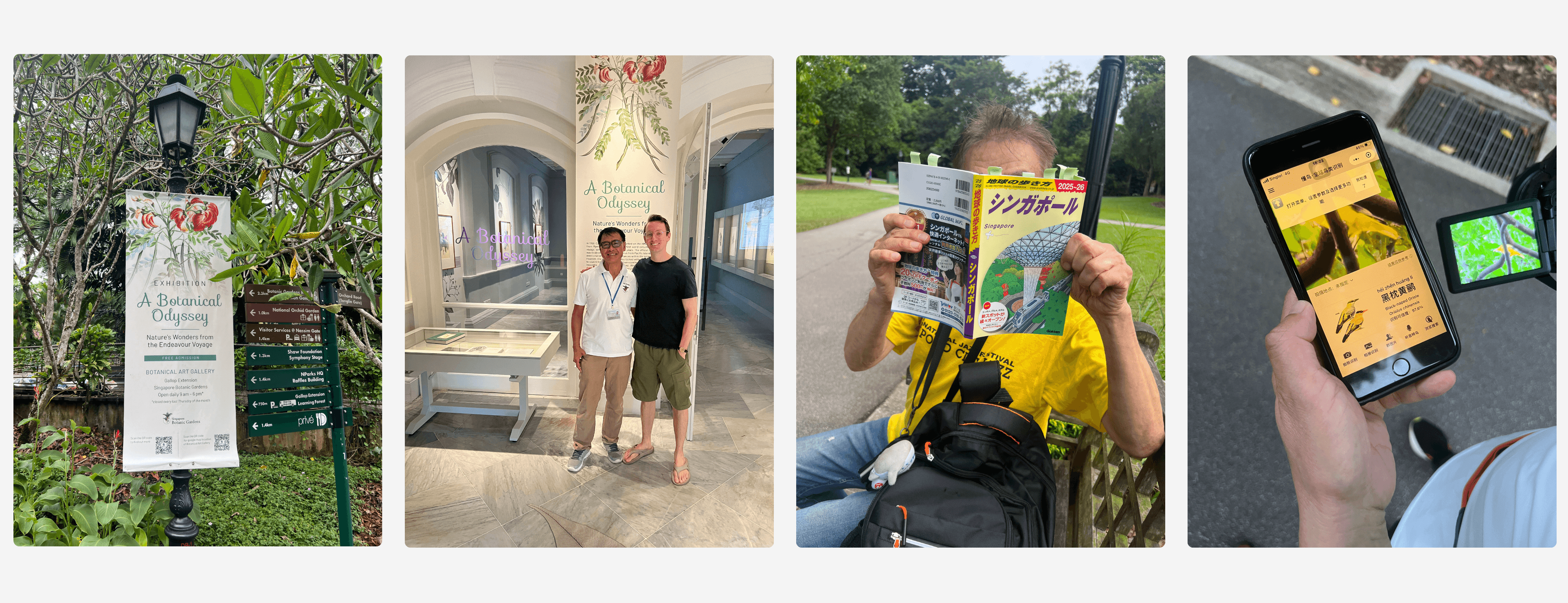
These observations revealed clear opportunities for technological intervention.
To synthesise the findings, we ran affinity mapping sessions, clustering insights to surface patterns in visitor behaviour and pain points. From these patterns we mapped the journey for each visitor type, from pre-visit planning through to post-visit reflection. These journey maps pinpointed the moments where a digital intervention could enhance the experience, giving us a foundation for ideation and design.

Initial Team Design
Working from these insights, we built a first version of the app together, covering route navigation, plant information via QR codes, and event listings. The functionality addressed real user needs, but usability testing with 15 participants surfaced significant concerns about the visual design and navigability: a textbook case of the Aesthetic-Usability Effect, where visual appeal directly shapes how usable something feels. With only a two-week window (the first week for research, the second for design and testing), the team made a deliberate call to prioritise functionality and ship a working prototype that proved out the core concepts. It was a solid base to build from once the bootcamp ended.

Redesign Process & Key Features
After the bootcamp I carried the work forward alone, rebuilding the app from the ground up on what the team had made while resolving the visual and usability concerns testing had raised.
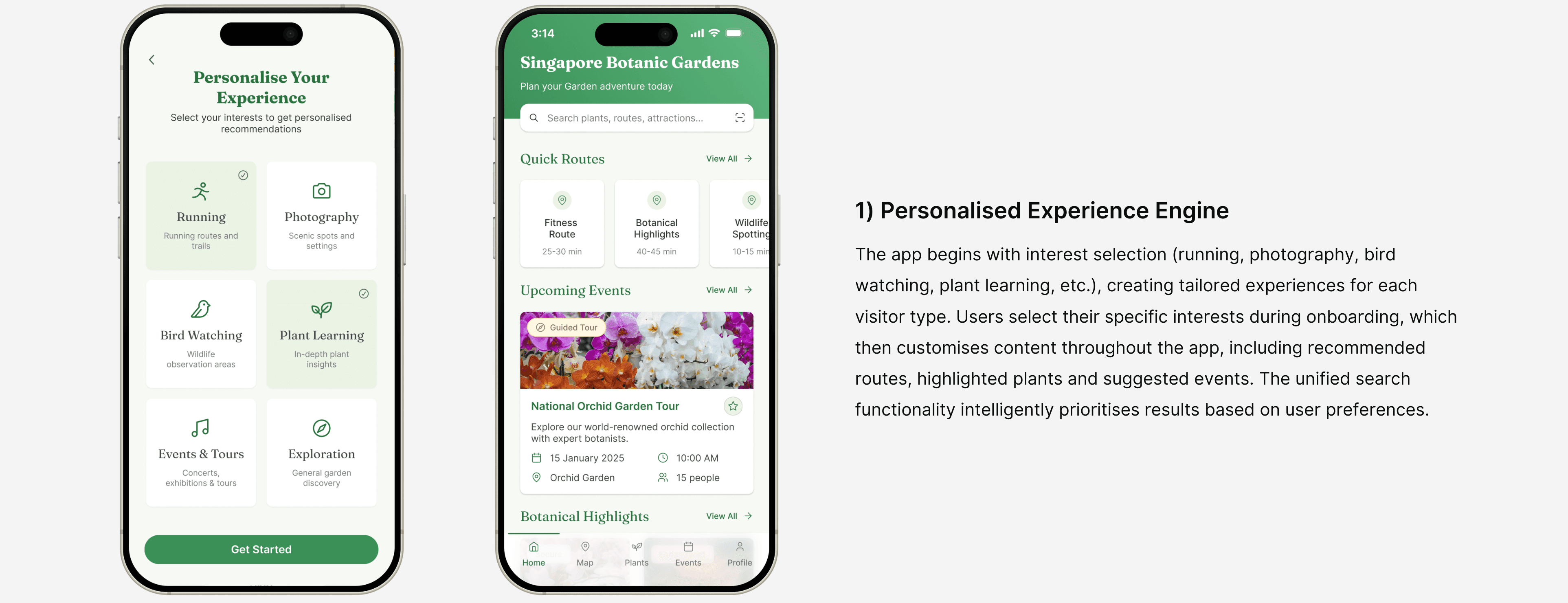
I created a clean, intuitive interface built around a natural green palette and generous white space, prioritising visual harmony while reorganising the information architecture so navigation felt obvious. Crucially, I designed the app to respect visitors' preference for an offline experience: a streamlined home screen acts as a command centre, giving immediate access to every key function (quick routes, upcoming events, plant scanning and search) and minimising screen time so visitors can stay focused on the gardens. A saving feature lets them keep plants, routes and events to revisit later, extending the experience beyond the physical visit.
This thinking shaped the four key features I developed to address the research findings:


Prototype Demo
Testing & Results
Comparative testing with 6 new participants produced a clear outcome. Task completion was 40% faster in the redesign. The SUS score improved from 54 to 86. Every participant preferred the new version. Perhaps more importantly, participants engaged with features they had missed entirely in the original, suggesting the redesign did not just look better but made the product more discoverable.
Key Learnings
This project gave me direct evidence that visual design is not a layer applied on top of usability. It is part of usability. The initial concept had the right ideas but the wrong presentation, and testing showed that participants could not separate what the app did from how it looked and felt. The redesign proved that resolving the visual system made the same features significantly easier to find and use.
It also showed me that good research is necessary but not sufficient. The insights were strong from the start. What changed between versions was not the understanding of the problem but the quality of the response to it. The redesign succeeded because it gave those insights a design system, an information architecture and a visual language that did them justice.