Managed App
Managed is an Australian property-management platform that has processed more than $5 billion in transactions. Property managers were finding it difficult to organise and prioritise daily work across large portfolios. I led a design sprint to redesign the task experience, helping managers work faster, see what was urgent and track what they had done.
Role
Design Lead
Year
2024
Client
Managed, Australia
Platform
Web Application


Introduction
Managed is an Australian property-management platform that removes the need for agency trust accounts by letting rent flow directly from tenant to landlord through secure banking. The platform has processed more than $5 billion in payments and is currently sitting at around $100 million each month.
Payments were solved, but the daily work of managing properties was not. Managers handled large portfolios, and every property generated a steady flow of tasks, from maintenance and inspections to rent reviews and compliance. They were struggling to organise that work, prioritise what mattered and track what they had finished. Our three-person UX team was brought in to improve the experience. Over two and a half weeks, I led the sprint, owning the research synthesis and interaction design behind three deliverables:
Action Centre redesigned around grouped, property-based cards instead of a flat task list.
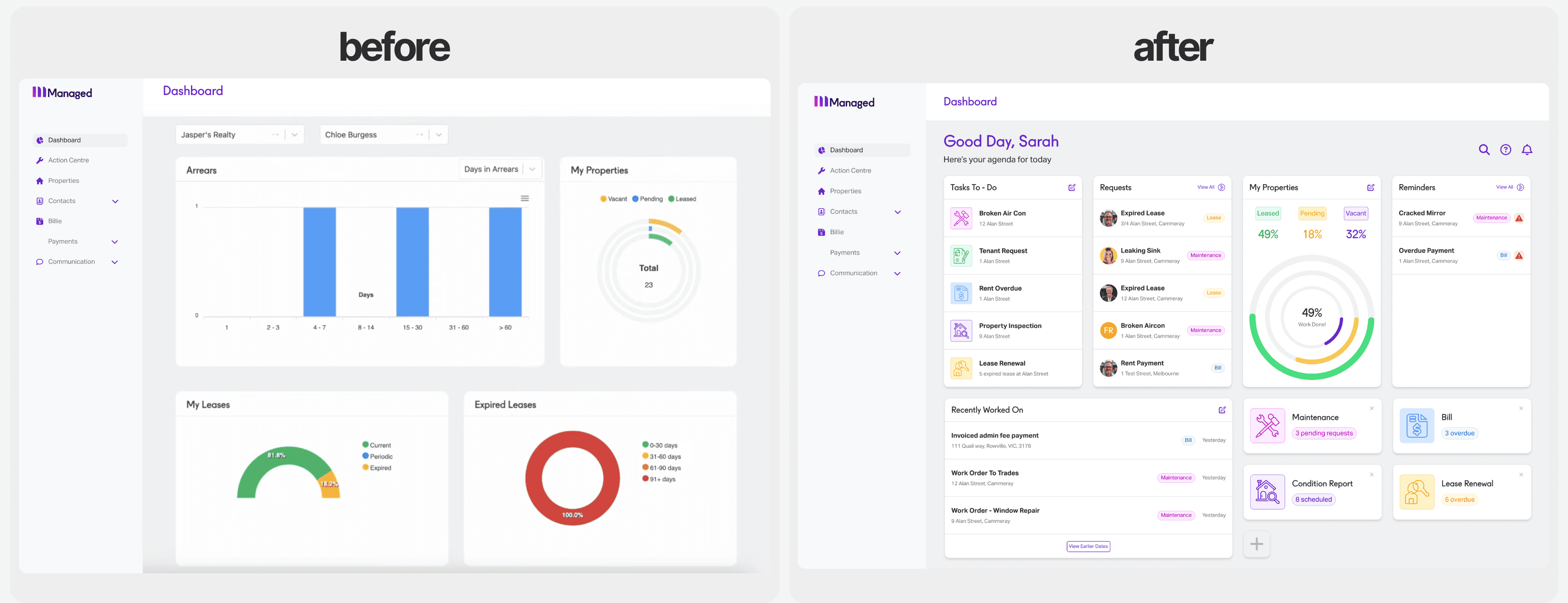
Dashboard rebuilt to surface actionable tasks rather than static charts.
Property overlay a new screen that let managers view a building's details, tasks and history and take action without leaving the page.

The Challenge
A manager's tasks arrived constantly, from across the portfolio, and the Action Centre, the screen where they handled all of it, showed every one in a single long list. A burst pipe sat next to a routine reminder with nothing to mark one as more urgent, so working out what came first was left to the manager.
Acting on a task was slow too. To deal with one, a manager had to leave the list, track down that property's details from wherever they sat in the platform, and come back for the next. Across a hundred or more properties, much of the day went on this back-and-forth. Nothing tracked what had been finished, so a manager could reach the end of a hard day unsure how much they had cleared.

Discovery & Research
We had two and a half weeks, so research moved fast. We audited the interface, interviewed property managers and studied competing tools. Nearly every manager we spoke to had built a parallel system alongside Managed, tracking work in spreadsheets, notebooks or apps like Asana, because managing tasks inside the platform felt harder than it should have been. When we looked at the usage data to understand where that frustration was worst, it concentrated on the Action Centre, the screen where managers handled all their tasks and the one they spent the most time on.
The underlying problem was a mismatch between how the tool organised work and how managers actually thought about it. The Action Centre showed one flat list across every property. But a manager's mental model was building by building, because each property has its own tenants, its own issues and its own state. Collapsing all of that into a single view made work harder to read and harder to act on. So we reorganised everything around the property, giving each one a single place for its tasks, details and history.
Design Solutions
From the research we designed three connected changes, all built around the same principle: organise work by property, not as one flat list.
1) Property Overlay:

Before the overlay, there was no single place to see everything about a property. A manager who needed to act on a task had to leave the Action Centre, find the relevant details scattered across different parts of the platform and navigate back. The overlay changed that. It brought a property's tasks, details and history together into one panel that opened directly over the current screen. A manager could see the full picture, act on what was needed and close the overlay without losing their place.

2) Dashboard:
We transformed the dashboard from a static display of graphs and numbers into an interactive command centre. The new design prioritised actionable insights, with sections for urgent tasks, new requests and important reminders. Property managers could now customise their dashboard layout to match their workflow, creating a personalised experience that helped them stay focused on what mattered most.
3) Action Centre:
Many of the managers we interviewed were already using kanban boards in Trello, Asana or Notion to organise their work outside the platform. They had chosen that structure for themselves, which made it a strong foundation to build on. We rebuilt the Action Centre around grouped, property-based cards that worked the same way, then extended it. Any card opened directly into the property overlay, bulk actions handled repetitive work in one step, and progress bars showed how close each group was to being cleared.

The card design was an exercise in information hierarchy. Each one carried the property address, task description, date, category, status, priority level, resident avatars and a subtask count. Making all of that legible without overwhelming the user meant being deliberate about every visual choice:
Type scale to draw the eye to the property address and task description first.
Colour-coded category tabs for instant recognition of task type.
Status badges showing where each task stood in its workflow.
Priority indicators that flagged urgency without adding noise.
Circular avatars so managers could see who lived at the property.
Progress bar that communicated completion at a glance.
When a manager finished all tasks on a card, a brief animation marked the moment, reinforcing the sense of progress throughout the day.

Process
We started together on paper, sketching and aligning as a team before moving into higher fidelity. Once we had a clear direction, I built the designs out in Figma as interactive prototypes we tested with property managers. Testing reshaped the design in one important way. We had organised tasks by property alone, but managers showed us they also worked by type, clearing all inspections or all rent reviews in a single pass. We kept the property as the main structure and added type-based grouping alongside it, and that became the card system. Other rounds simplified navigation and cut dashboard features that were adding noise without adding value.


Reflection
In comparative testing, every participant preferred the redesigned experience. Acting on a task went from an average of three to four clicks across multiple screens to a single click into the property overlay. The Action Centre's card-based layout reduced the time managers spent scanning for relevant tasks, and the dashboard gave them a clear starting point each morning.
We delivered the redesign alongside Managed's first design system, defining the patterns once so future features would inherit them. We also flagged one clear next step: a mobile version of the platform. Property managers are frequently away from their desks on inspections and site visits, and the redesign's value would be limited as long as the experience was confined to the web.